


RIGOL Starts 2021 with a Rebrand

2021-03-08
Since being founded in 1998 RIGOL has continuously evolved. While we express this evolution in everything we do, from the technology and solutions we develop through to our company culture, it is also important that we visually represent who we are. That’s why we have redesigned the RIGOL brand icon and updated our signature color to convey the power, performance and progress of RIGOL.
The new brand icon reinterprets the value proposition of RIGOL in the test and measurement industry. It is dynamic, rhythmic and represents RIGOL’s spirit.
These new colors combined with modern design represent the passionate, proactive, and unparalleled brand experience that RIGOL offers.

The story behind the new design
There are three background colors, white, RIGOL’s signature yellow, and black, which can be adapted to different application scenarios.
The icon design takes inspiration form the five elements to illustrate how we deliver complex solutions in an easy-to-understand way. These elements also represent the RIGOL company culture, which will yield enduring excellence in the years to come.
Metal, the metal honeycomb structure
The hexagonal honeycomb structures represent RIGOL's digitalization. RIGOL’s team connects global talent in the continuous pursuit of technological frontiers with our honeycomb-like collective intelligence. Meanwhile, it also represents “Innovation”, one of the most important core values of RIGOL.

Wood, imitating R
RIGOL's business name begins with the letter “R”, which also stands for root and can be interpreted as wood. It is an important part of the tree's nutrient intake. At RIGOL, the dynamic and energetic engineers design solutions for engineer users and create value for the company. They represent RIGOL's perennial source of creativity.

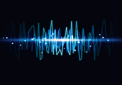
Water, a waveform
During the domain test you will see a waveform shape like water. Water represents a long-standing connection, indicating that RIGOL will continuously deliver technology and value to customers, and build a bond of loyalty.

Fire, a fast edge waveform
The flame stands for passion and speed. In signaling, a fast edge waveform represents a step signal with infinite harmonics. This means that RIGOL is an energetic brand. It will constantly update itself to realize customer successes with Possibilities and More.

Earth, a spectral waveform
The spectral waveform just looks like a mountain, wide and endless. This not only represents the frequency test and measurement, but also represents the comprehensive solutions provided by RIGOL.

We’re looking forward to seeing where the new brand image takes us, helping show how our engineers make technology exploration possible to achieve Possibilities and More.

2

RichScan